DataStories
| home page | next: final project wireframe |
Final Project Outline
My final project intends to exploare the mental sport of competitive programming (CP). In a typical CP contest, participants will try to solve as many problems from a set of around 6 problems in about 3 hours. They need to be able to come up with creative solutions to never before seen problems, and then code their ideas into a bug free implementation that passes a comprehensive set of tests.
By analyzing data from popular CP websites, I want to show how practice can improve your performance. I’ll look at the most common topics and their prevalance, classify users based on their solving speed and coding speed, and consider how much practice can help to show improvement. By the end, I hope to be able to say something about the best way to practice in order to improve: is it better to solve a bunch of hard problems or just to solve a lot of problems? To solve over a long period of time or within a short burst? How much influence does talent have over work?
The story will begin with an introduction. It will chart out the popularity of the sport over time and familiarize the reader with what a typical contest looks like. Then we get into the more difficult and exciting part of the project, which readers are most interested in: how do I get better?
In this section, I want to show the correlation between practice and improvement. Then I want to try and dive into factors that cause people to deviate from the standard. I’ll classify users into axes based on their first-solve speed, total solve counts, and number of incorrect submissions. Then I will use this grouping to try and get a better estimate of how much different types of people improve with practice, and to see if is some kind of ‘skill cap’ that certain types of people face.
The final topic to explore is the actionable one. I want to create a grouping for different practice strategies: “solve hard problems”, “solve more problems”, and “do more live contests”. I’ll explore how different practice strategies correlate with success.
Finally, I can produce a call to action based on the results of my analysis. I will give a summary of how much people should expect to be able to improve, and what people can do to reach their potential.
Though the data analysis isn’t done yet, one potential one-line story could be
Anybody can become quite good at competitive programming by solving lots of problems, though ratings beyond 2100 may require talent.
The target audience of competitive programmers consists of tech-aware programmers. The age range is considerable (12~50) and they will likely have a basic understanding of how to interpret data in a chart, though I wouldn’t expect much specific data visualization experience.
Data
For the introduction, at least it it easy to find data on the number of current registered users for popular sites by googling, though there isn’t much for the total number of people who have been practicing the sport over time. We can also see data for some contests online line google code jam. There are also some blog posts with useful data, this is likely the most useful.
After this, though… there is no good dataset on the internet for a lot of this, it’s quite a niche topic. The only datasets I could find are list of people’s rating on each site, and lists of problems along with their editorials. It seems like we are doomed…
Luckily, the most popular coding platform, codeforces, has an API where you can read almost all of their data. Still, we have to scrape a lot of data from it, and since the API is rate limited, it could take days of CPU time get it all, not to mention hundreds of lines of code for all of the edge cases…
Luckily, I know how to code and started the process over break! After a month, I got all of user data stored locally and on kaggle! Here are the links to the two datasets I created: user data standings This will be the basis for most of the visualizations beyond the introduction.
Since it’s a brand new project, we can be excited to know that the insights in this project are going to be totally original :O I’m exited to see how it turns out! However, for now, there is still a lot more work to do trying to refine the data into some nice visualizations.
Sketches
First, I think we can have a chart involving the proportion of users using each site by googling all of the popular ones, along with a chart that shows the increase of popularity over time for big contests and websites.
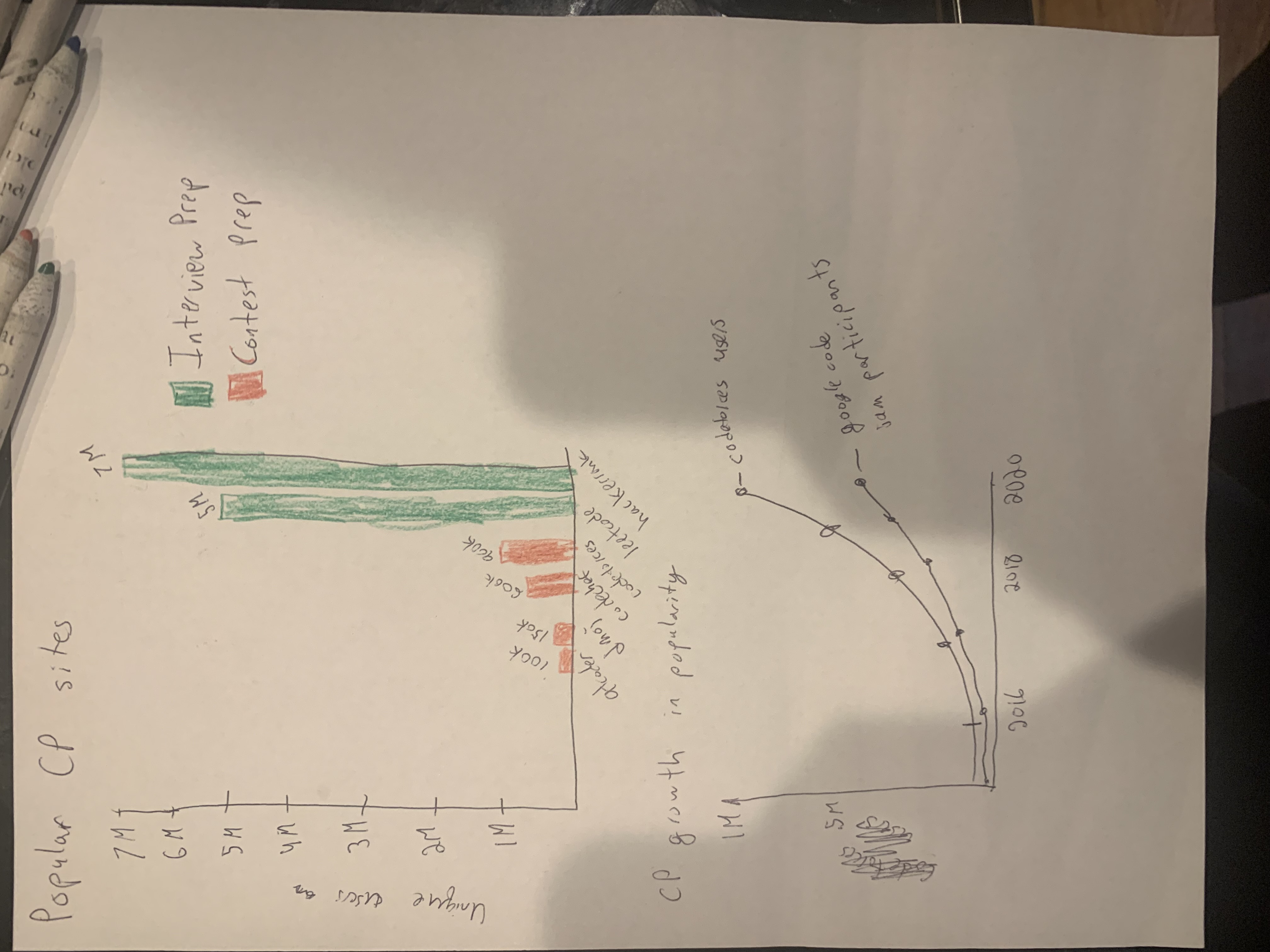
This section may include some text discussion here with reasons for people becoming interested. A lot of causal interest comes from wanting to do well in programming interviews, so that’s where the big sites come from.
For the unfamilar user, we can try to give them some insight into the topic by showing them what typical problems look like. We will feed them an exploratory visualization - what topics are most problems focused in, and what difficulty do the topics span? For now I have made this very basic visualization in flourish. Note that there is a very standard color scheme for ratings used in codeforces, I am using these color codes for all of my graphs. For a first attempt at visualizing, I put some of the topic data in a chart.
Depending on how you select the filters, this chart feels a bit noisy. I think I may change the visual to a minimal bar chart later. I didn’t feel that there was much interesting correlation between the difficulty and the tag, so in the final version I think I will skip on correlating with the problem difficulty.
Now, let’s start trying to look at user growth over time, and answer the question: does practice work?
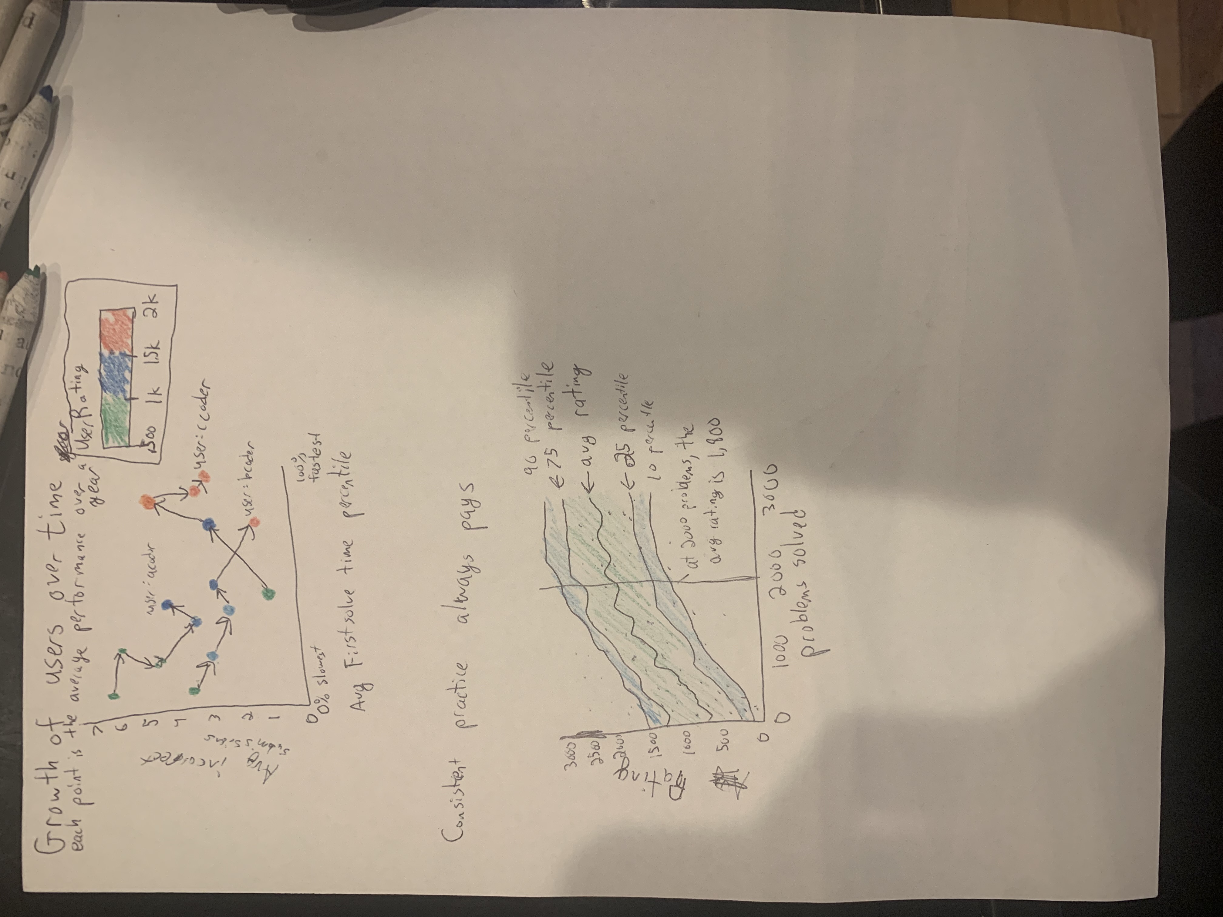
Let’s start with the second graph on this page: a very basic visual that will compare the total number of problems solved to user rating, along with some error bounds. This will be a nice way to start off and there isn’t much data preprocessing involved. It will be a very interesting to see how much it takes the average person to get to a specific skill level.
Now let’s move the the connected scatter plot above it. It’s an attempt by me to merge 4 variables into one graph and follow the stories of a few users. The goal is to answer the question “what kind of users see the most improvement”? There is some speculation that people who can solve problems really fast might have a higher skill barrier than people who take longer to think things through. So we plot the time to solve the easiest problem in the set and compare how the rating changes over time. Relatedly, we have an axis for the average number of incorrect submissions to see if people who make less bugs in their code have higher potential. While it conveys a lot of information, this graph is quite confusing. I plan to use it to explore the data, and once I can dilute that exploration into insights, I will revise this graph to be simpler and highlight the main points.
Now, for our final plots, I want to see if there are any variables strongly correlated to improvements. For this visual, I’ve preprocessed the data into 1-year periods. For each period, I find the rating change and the number of problems solved, and see how they scale together.
We establish that practice does lead to improvements, on average. We can set other independent variables as well: this next graph has the number of ‘hard’ problems that the user has solved.
The trendlines are helpful but there is a ton of noise in both of these graphs, so I think I want to get a correlation coefficient out of the data. It’s about .3 in the first case and .4 in the second case. Clearly, there is a lot of noise here. If time permits I intend to try and filter the data in various ways to get a correlation coefficient closer to 1.
Still, there is already one really interesting observation that I will highlight in a callout: the line of best fit to predict rating change over a year has a slope of about
-.04 * n_problems_solved + .9 * n_hard_problems_solved
so solving problems that are not hard does not help develop skills at all, which is quite surprising. In fact, there is a statisically signifigant negative coefficient!
Method and Medium
For the final project, I will be doing all of the data processing in python to create csv files that I use for either flourish or tableau. Then, I will put these charts into a static website published using shorthand. For the presentation, I will just scroll through the website while explaining what the charts represent.